As long as you realize that WDL buttons actually change size when you change the size of the window, in that they are dynamic… you could use the samples attached.
One is a blank that you could use in most bit image packages, the other is an example Pressure Button.
The font used is Verdana which should be common on most systems.
The color is off black. Looks to be close to 5C5A5C
Julian would know exactly what color he used though.
I can provide both Paintshop Pro and Photoshop raw files it that helps later today when I get back to my office. I don’t have those tools here.
Attached are the 3 states of the new style button for next version of WDL which should be released very shortly. The font is Verdana and the colour is #333333 - a websafe colour.
Out of interest, how significant are web safe colours these days? Back when the web was new and 256 colour displays were a rare novelty it was significant, but I wonder how many people are viewing the web with 256 colours these days? I’d have though that the minimum for most people these days was 16-bit colour (on PDAs), with many users having even better quality. I realise that there are still some mono-browsers (Blackberry PDA as an example), but 256 colour (or less) surfers must make up a pretty small percentage of users these days.
I wondered that as well, then recently I was on a training course where there were PCs in the coffee area so you could check your emails etc during breaks. All the machines were basically terminal server clients at 256 colours. There were a lot of sites that looked very odd! Therefore I still think about it especially when it’s something like text.
Well she only said she invented the web colour scheme nearly 10 years ago and didn’t mention that she invented any layouts for ergonomically perfect web pages!
Once, long ago, monitors could display only a restricted number of colors without dithering or other color discrepancies. The traditional solution to this problem was to use a restricted color palette known as the Netscape 216 colors, browser-safe colors or the web-safe colors. In hexadecimal form, the web-safe colors are composed of three pairs of identical hexadecimal digits selected from 00, 33, 66, 99, cc, and ff; for example, #000000 is black, and #cc0000 is red.
Time passed, as it so frequently does, and new hardware supported thousands or millions of colors. People grew tired of the old 216 colors. They wanted more earth tones, more variety. The web-smart colors are those 4096 colors composed of any three pairs of identical hexadeximal digits (0-9 and a-f), such as #dd1188.
The unsafe colors are the full set of 16,777,216 hexadecimal colors, featuring any color between #000000 and #ffffff, such as #5a832d.
However it all comes down to what you are prepared to accept. If you want to guarantee that your corporate colours are always going to be intact then you’d use websafe or even restrict yourself to 16 colours. In the real world a compromise is required - absolute colour accuracy is virtually impossible. If you look closely you can see differences between browsers (on the same PC) in the way they render colour.
I usually still use websafe - if I can’t or don’t want to then I’ll check on a reduced colour monitor to make sure the transformations are acceptable.
It’s the single button mouse folks you REALLY have to worry about
Here’s another useful color tool, it displays the html code for the pixel under the mouse pointer so ya can rip off a cool color you see on a website http://hjem.get2net.dk/fec/software/htmlcol/
So web-smart are a random selection of colours that just happen to have matching numerical values for each colour component and the rest are unsafe? That sounds like a very arbitrary selection criteria and I can’t see any logic for saying that the non-web-smart colours are unsafe. If they’d been called ‘duo’ and ‘non-duo’ colours (or something similar) I might have been able to accept them, but the use of the word unsafe makes me want to throw my dummy out of the pram and not use the colour wheel on a matter of principle :x
For my next trick…web-super-intelligent colours are colours where the second digit of any colour component is one higher than the first digit, e.g. #123456 and #EF7890. All the other colours are highly unintelligent numbers
On the grounds that most corporate colours are chosen by PR-types from a huge Pantone book containing 99-gazillion colours, the chances of them being correctly rendered on any PC display or standard printer is pretty much zero. Of course you have to have the colours chosen by a suitable graphics design ‘house’ who will charge you
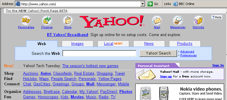
I looked at the color codes on some of the major sites, Yahoo etc., and I don’t see any of them worrying about limiting their color choices.
I agree about those PR guys. I was involved in a joint venture once where we paid one of the famous silicon valley PR gurus $ 45K to help us decide whether to call it “companyA - companyB” or “companyB - companyA”. I guess it would have cost a lot more if one combination wasn’t virtually unpronounceable.
Don’t get me started about Yahoo. They haven’t specified a background colour to their home page so on some browsers it appears as a default grey. I’m sure that’s not what they intended as other pages have a white background but it does demonstrate a lack of attention to details.
That’s interesting, it’s white on IE and FF so I would never have known. You can see they are expecting the background to be white by the cheesy way the tabs look on your version: