Happy New Year Brian! 
This response is a bit long because I am trying to provide a real and logical justification for my request.
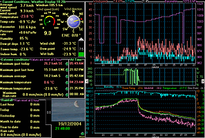
I have played with the scale adjustment features of WD without getting it to display the data in an easy to interpret way.  I have noticed on your website a display of WD Live with history data for last year. According to the history data, the coldest temperature last year was 3.1C on Jul 24 and the the hotest was 23.1C on Nov 12. I’m thinking that this (your) real-life experience may be part of the difficulty in my explaining what I would like to see.
I live in Canada. Minimum year round temps are in the -40C to -50C range. Hotest year round temps are in the 30C to 35C range. We often see temp swings in one day of 10C to 20C. (Note: This is the full range of the NZ WD Live year round weather for 2004.)
I believe…
A useful graph should show temp plots around some reasonably critical temps. 30C is a high reference temp. Temps above this start to be uncomfortable. 0C is a mid reference temp. Temps above are fine. Temps just below, with rain, mean freezing rain and this indicates real danger. -20C is a low end comfort reference temp. Temps below this to be uncomfortable. Of course, any wind produces dangerous windchill. And then there is the -40C reference point. This is the real danger point. Add a windchill and this becomes a warning to NOT go outside. Oh… I forgot to mention, temps above 35C with any major humidity is also approaching a danger zone. (I would expect most people would intuitively have their own reference temp values. They may not agree exactly with the comfort ranges I’ve mentioned but their reference temps are likely within 5C to 10C of my reference temps.)
It would be nice if WD would display temps on graph lines that easily, and consistently, show these reference temperatures. This would be accomplished by forcing the graph lines to be at intervals of 5C.
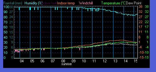
The current WD version has what seems to be an artificial default low temp of about -8C and default high temp of 40C. (This seems to be the default temp range on the NZ WD Live history records.) I can change the low temp reference by lifting or lowering the temperature line. I can adjust the low to hi temp range. I can even set the highest temp value. No combination of these adjustments allow me to fix the scale interval to be at 5C increments. No combination of these adjustments allow me to fix the scale to repeatedly show the 0C reference (or any other reference temp) as an actual graph line. No combination of these adjustments allow me to fix the scale lines to have the same number of “integer” degrees between them. This means reading the graph requires some level of mental interpretation rather than intuitively knowing by seeing… temps above the line are OK and temps below the line are not. (This is similar to the argument why analog gauges are some times better than digital gauges.)
Having played with all the WD graph controls it seems to me the algorithm using these controls is likely quite complicated. This, no doubt, evolved over time by adding small incremental features to the graph display. Perhaps it might be worthwhile re-think the graph display controls with an idea of simplification. I’m not trying to tell you how to design WD. This is only a suggestion.
So…
What I would really like to see is a graph with fixed 5C increments per line.
It would be nice to have an automatic way for WD to look at the Hi and low temps in the graph interval and automatically position the graph mid-point to show these high and low points. If the range is too big for the graph then the older temp value can be discarded in favour of showing the most recent temp within the 5C line at the top or bottom of the graph.
Note: When I have used Celsius temps the same holds true for Fahrenheit temps. 5F degree graph lines also provide visual intuitive knowledge. Of course, 32F is not as easily shown but perhaps this could be a special tweak to show this critical reference temp.
I believe this behaviour would mean a lot of the tweaking display controls would not be required.
I believe this behaviour would allow WD to automatically adapt to the temp ranges experienced in most (or all) parts of the world.
I believe this behaviour would be much easier to set-up and interpret when looking at the graph.
Is there any chance of seeing this behaviour in 2005?
Brian, Thanks for an excellent application and for considering my constructive suggestions.


