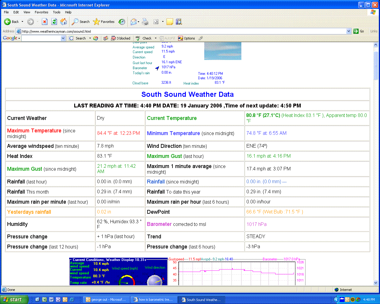
I have noticed that summary.gif and station.html produced by WD show differing barometric trends. For example the gif file can show a rising arrow whereas the table produced by html can read steady or falling.
Is there supposed to be a relationship between the two? I would expect that they would both show the same trend.