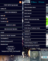
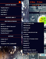
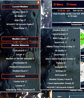
I have quite a few links on my side menu now, I’m thinking adding nested links would keep it better organized and allow me to keep the menu at a decent length.
For example: Right now we have Weather Networks as a header then the list of sites we upload to underneath. Instead, I’d like the Weather Networks to be a top link, when clicked would open up a panel of the networks, so they are hidden until the header is clicked.
Well I’m not happy with the style yet, it needs a lot of little tweaks, but the bones are in place…
{EDIT} Some of the more important items will go back to showing up on the main menu, like radar, advisories, etc.
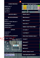
LOL that just lined up perfectly, it was the the block behind the menu. It DOES look like it’s part of the menu, but it 's just behind. Maybe a bottom border on the menu would stop it or a different color border on the boxes… Hmmm
Add a line to the main menu ![]()
I added a border to the menus and the boxes, just to keep it consistent.
As an aside, I was looking at all the different PWS sites to get ideas and this one - WeetingHome Weather Station (WD version)
WOW! That is beautiful.
If I’m not mistaken that is the first version Wim produced in January 2019, after taking over from the original author (weather34): you can see mine from the menu on my current version. The cursor has become a green blob because of a CSS problem.
Yours looks great too! It’s got a light airy feel to it.
Thanks. You can switch it to dark ![]()
Does it become dark and airless then?
Yeah, sort of claustrophobic ![]()
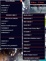
I put a little more work into the menu. It still needs a little more. I messed up the padding on the top “X” and I need to adjust some of the centering, but it’s pretty much where I want it.
It’s been fun. I am re-learning a lot of stuff I haven’t used in quite some time and I don’t know if I’m doing it the “right” way, but it works.
Meanwhile, you could change the UK flag in the footer:
My son-in-law is British, so I left it, out of respect for him… ![]()
That’s weird, I swear the flag AND the language was set right the other day. Maybe I messed with it?
Either way thanks for pointing out my flaws! ![]()
They’re not your flaws. . . but I know how you like to get things right ![]()
How is the readability here? Is it easy enough to read the items on the menus, or do they need more work? In case the image is to blurry, you can see it in action at https://rikostan.com/pwsWD/
I’m thinking the main menu headers would look better if they were a little more opaque. Also, I’m not sure if the links in the fly-out menu need anything else to make them standout a little more.
Looks good to me. . .
Thank you, sir.
Still tweaking it a bit here and there, but I think I found the look I was after!
Me too. . .it never ends ![]()
