Averages? Medians?

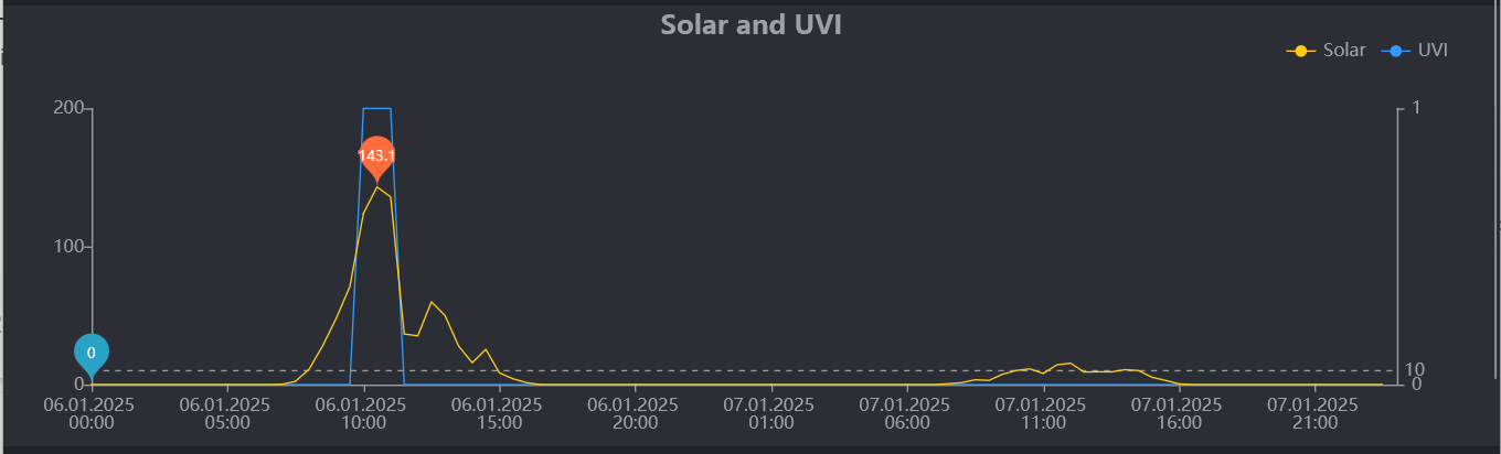
Hi there, I want to share my perhaps noob confusion, but I have no idea where to find the answer. I’ve had my ecowitt WS80 for a few months now and in both the mobile app and the web app there are dashed lines in the sensor graphs, always with a value.


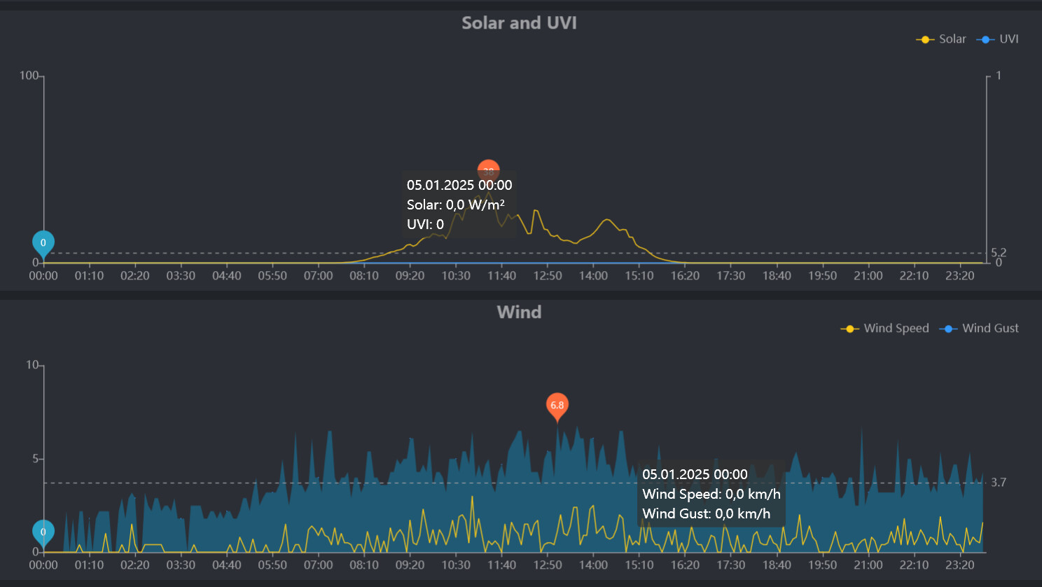
I thought these were averages over the displayed period, but what is weird is that when I look at a week, it says for wind for example 6.4 kph on the dashed line, but if I look at the individual days, it says 6.7, 8.4, 7.7, 2.5, 2.4, 3.2, 3.1 kph respectively. The average from that gives 4.85. The median from such small set is of course 3.2, which wouldn’t be a very helpful value.

So I wonder if it’s a median value from all the values recorded? But it seems a bit silly - if I look at weeks in a month and it says 6.4, 12.3, 14.4, and 6.6 and then look at the month and it says 13.3, it seems a bit suspect.

The weirdest is then the yearly level (which is incomplete in my case), but over four months it was 15.2, 12.1, 13 and 13.3, but somehow, for the year 2024 the value displayed is 20.2 kph! That’s bonkers and we surely have not had 20.2 kph average OR median wind gusts of 20 kph.

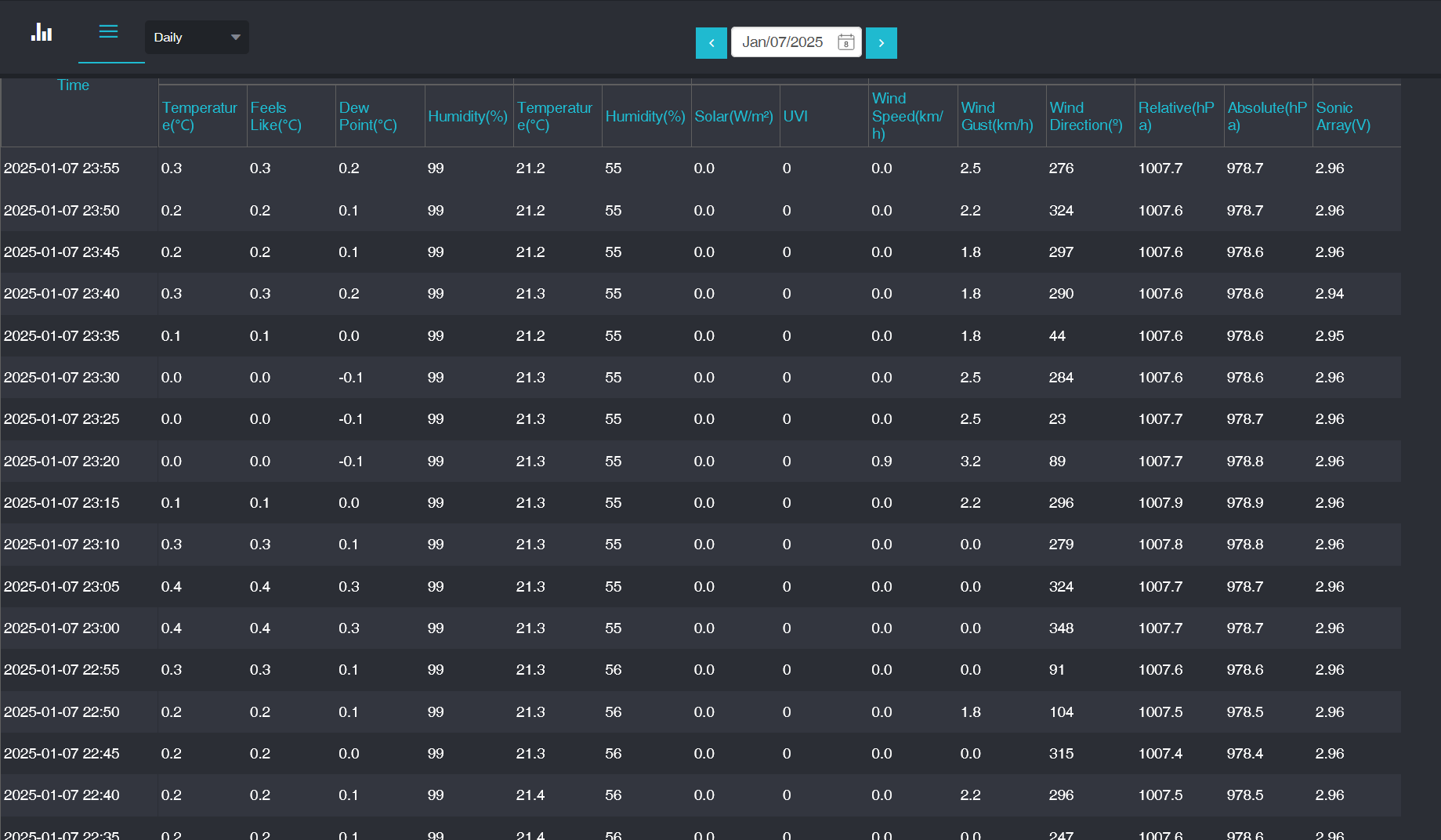
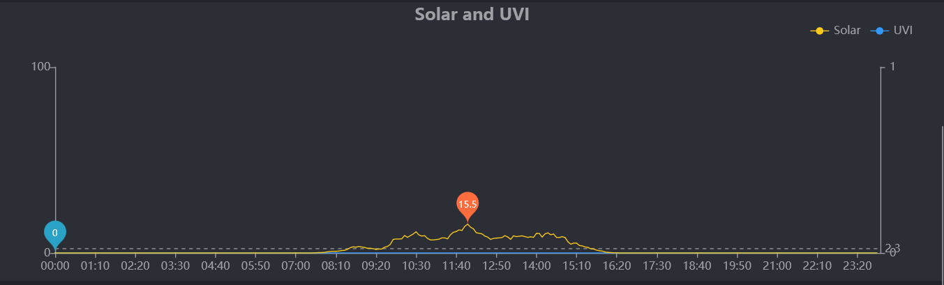
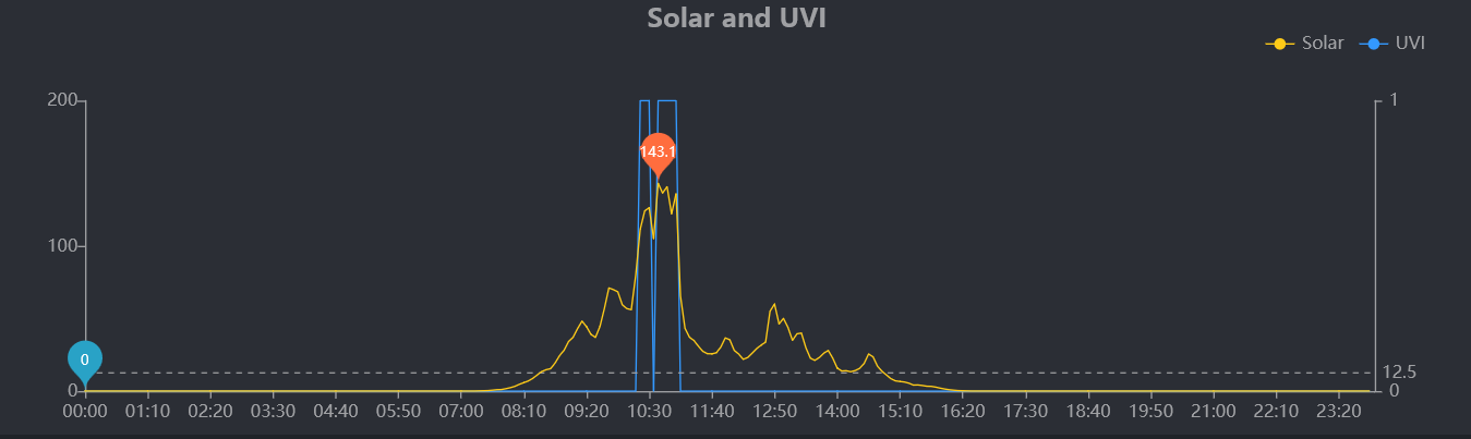
The situation is pretty much the same with solar irradiation. At first I thought I could use the “average” value to calculate the amount of energy available for a potential solar panel instalation, but the values don’t seem representative. If I used the dashed-line-value of W/m2 and multiplied it with the number of hours in a year, I come up with a totally crazy number of Wh.

Does anyone have any ideas?

To be honest I’ve seen them and ignored them. I suggest you ask on the relevant section ( Ambient Weather and Ecowitt and other Fine Offset clones) of the WXforum as that’s you best place for an answer.

Stuart

1 Like

Thanks, I’ll try that too.

I decided to ask around on the WXForum as you piqued my interest. Seems that these values may be the average over the range of the graphperiod but not found any documentation about it. Any average or mean needs a definition of the period as well or it’s about as much use as a chocolate teapot :wink: anyway I’ll see if anything else comes up.

Stuart

1 Like

The person who replied to me actually took the time to download the displayed data and calculate his average and it matched the dotted line when rounded to 1 decimal place. So it is the average of tbe displayed values. Why Ecowitt don’t document this clearly I don’t know.

Stuart

Cool, I love to pique interests. And glad it’s not just me being slow. I don’t have a WXF account, since I consider myself less than even a hobbyist, and out of laziness, I posted the question on reddit instead. So far no solution.

Today I looked more and I noticed that I can switch from the graph for the period to a table/chart. For day it shows 5 minute interval values. For week it’s 30 minute intervals. For month it’s four hours.


But I randomly checked that the table for the monthly view states for yesterday 13:00 solar irradiation of 10.8, but if I look at the day view, at 13:00 the real value was 8.3. Actually, 10.8 is a peak value in the interval between 13:00 and the next point of 17:00. But even if that’s the way it works, it’s ridiculously useless for judging how much sunlight there was, because this meagre peak occured at 14:00 and by 16:00, it was completely dark.

So it seems conclusive that it takes peak values from intervals. It doesn’t calculate averages and that’s why specifically for wind and solar, where peaks happen much more quickly than with temperature or humidity, it seems to introduce quite some bias I think. I guess if I know the chart is showing peaks, it’s useful, but I think averaging values would have been much better for being able to judge how much wind or how much sunshine there actually was in the periods in question. The fact that this discrepancy gets worse and worse the longer the window you’re viewing, shows that it’s not a very good approach I think.

Then again, I’m not a meteorologist and maybe this is the way it’s done?

Can you link me to that post please? I really don’t think these are averages of all values.

I guess my problem may have morphed a little. It does seem that the dashed line is in fact an average of the data shown in the plot for a given period. But the way datapoints are picked for longer periods doesn’t seem to be done by averaging the intervals between timepoints, but rather picking the peak value between those timepoints.

The result of this is skewing towards higher apparent values in longer-period views.

It’s already apparent on two days. One day of overcast weather with an average irradiation of 2.3:


Previous day with an average of 12.5:

Now if I display a custom interval of those two days, I would expect the average to be 7.4. But when I do that, it’s actually 10:

The intervals in the plot/chart changed to 30 minutes and the value stated for those 30 minutes is not the average value for that interval, but the peak value.

Again I guess it kind of makes sense - in the yearly plot there’s one datapoint per day, which means you get a plot of peak sunlight moments over each day… But this can also be highly deceiving, because in such a plot, a day that was perfectly clear with full sunlight will have a certain peak, but a day which was mostly overcast and for a while the sun broke through may have even a higher peak due to the cloud enhancement effect. In effect, it presents the overcast day as a sunnier one. While it may be interesting to have a plot of “record values”, averaged values would really be better for judging actual weather conditions.