ProblemCSS missing for light theme menu solved 05-05
Discussion “Round” “Square”
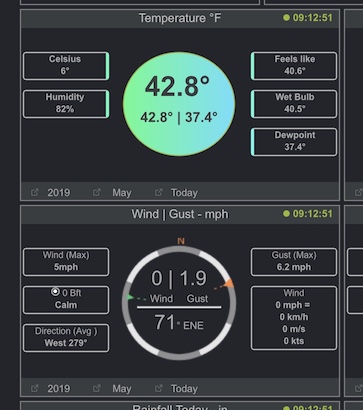
The dials ( the sun-dial barometer) a.s.o. are round.
That can be optional for some other large “things” in the middle such as for Temperature, AirQuality
But not for all. Rain remains a rectangle-bucket. Indoor uses a coloured house
All small parts with text in it have to remain in an rectangle, with or without border.
The other languages, translates from English, and need for the translated texts more or less room.
So the texts need to freely move from the middle as it is now.
“Light/Dark theme”
There are only a dozen or so items different between Light/Dark themes.
It is therefor feasible to have far more themes to choose from. Like yellow, red, green a.s.o. As with other templates.
I am now testing the “extra blocks” version.
I could choose (for now) for adding an extra row (4 rows of 3) or an extra column (3 rows of 4).
But the latter looks far better on a tablet.
I also added an extra small block in the top-row as those are all less wide compared to the large blocks.
In easysweather one can select yes/no for the extra small block
And yes/no for the extra column with the normal blocks.
This is an alpha and meant to get the feedback, thanks
Yes it it to wide, calculation error on my side. 4 columns ==> 1296 px.
Can use an extra row and not an extra column.
The extra row will force a scrollbar, but there is ample room for that.
I will check later how to trim it to 4 * 320 and not 4 * 324 px =>max 1280